 Designing
Mobile Responsive Templates has become a trending topic in web today.
Mobile Technology and Mobile Traffic has evolved immensely from 2010 to
2013 especially in Asia USA and Africa. People now prefer reading emails
on their iPhone as compared to using their Desktop computer. Fast
wireless wifi connections is another reason that encouraged usage of
mobile devices like smart phones (Apple and Android), Tablets, netbooks
and low resolution cellphones like NOKIA.
Designing
Mobile Responsive Templates has become a trending topic in web today.
Mobile Technology and Mobile Traffic has evolved immensely from 2010 to
2013 especially in Asia USA and Africa. People now prefer reading emails
on their iPhone as compared to using their Desktop computer. Fast
wireless wifi connections is another reason that encouraged usage of
mobile devices like smart phones (Apple and Android), Tablets, netbooks
and low resolution cellphones like NOKIA.
More
of our clients today are interested in fluid and flexible Blogger
templates compared to traditional Fixed width Layouts. We have received
over a hundred requests for this tutorial series. We are therefore
releasing the first ever complete step by step Tutorial Guide on Mobile Optimized Responsive Blogger Templates
to the Google Blogger Community. You will learn how to enable your Blog
layout adjust itself automatically to the Device Screen Size.
Tutorial Series
1. Design a Responsive Blogger Template
5. Using Mobile Friendly Images in Blogger.
7. In Progress..
Note: You are reading Part 1. Read it only for understanding the theory behind what Mobile friendly blogspot templates are. We will do the coding part from Part 2 onwards which is Common Device Breakpoints.What is a Responsive Layout?
In
layman terms a responsive webpage is a flexible design that adjusts its
width and styles according to user device Screen size. It will look
different on a Desktop Screen and much different on a smart phone or
Tablet (has two sizes: portrait and landscape) . No matter what device you use a responsive design will adjust itself perfectly to give you a Clean user interface.
For Blogspot Users:
If
you have activated Mobile view for your blogger blogs then if you view
your blog in a smart phone, you will find its look completely different
compared to a desktop. By default all blogger blogs are made mobile
optimized but those styles are too simple and doesn't represent the blog
in its true form therefore we will learn to create a custom designed
Mobile Friendly layout for Blogger ourselves. This will allow you to
customize your mobile Template and have a better control over the
display of elements such as Ads and widgets on your site.
Therefore in our case we don't need the default mobile view at all and we have disabled it completely.

An example of a responsive website is the latest design of MyBloggerTricks.com. Just view it using this amazing tool linked below. Observe clearly how its Menu changes as the size of the screen shrinks. You can also test it by simply adjusting your browser window size using your mouse cursor!

Just insert the following URL in the Input Field
http://mybloggertricks.com?m=1
Are you too late?
If your blog layout doesn't support auto adjustment of layout and loading of new stylesheets based on Device width then you don't need to worry because Responsive layouts is a new idea and it will take time till everyone applies it. You wont believe this but Giant Corporate sites like TechCrunch have not yet upgraded their theme to a responsive one and moreover Google is so slow that it has not even introduced auto-width-adjusting AdSense Ads for such fluid layouts. So it will take time till this new terminology is well acknowledged by majority of websites and internet firms.Update: TechCrunch is now responsive and Google now favors Mobile friendly Pages. Google now ranks Mobile friendly blogs better and give them preference in Mobile search results over sites which are not yet mobile optimized. So hurry up and save that precious mobile traffic which you might be loosing at this moment!
How are Responsive Layouts Designed?
If
you know some basics of HTML and CSS then trust me you are going to
find it extremely easy and you would love to play with your layout
columns using just your browser. CSS3 has introduced several new
techniques of achieving some frequently used functions. It is no more
limited to just styles but it now supports some really interesting
front-end programming functions like @import, counter-reset, animations, transitions etc. and the most popular amongst them are Media Queries (@media ) that acts like conditional IF statements used in blogger.
Normally
mobile browsers emulates a desktop view by squeezing big resolutions
into small screens that is often difficult to read and browse. You must
be familiar that how difficult it is to click a web link in iphone
unless you zoom it.. In order to tell the browser to detect the
screensize we will add a META viewport tag inside <head> section
of your layout.
Any Template can be converted into a flexible layout in just two simple steps:1. Add Meta Viewport just below <head> tag
<meta name="viewport" content="width=device-width, initial-scale=1, maximum-scale=1"/>Here width=device-width will detect the screen size.
2. Use CSS3 Media Queries
Update: Ignore the Breakpoints below and instead follow our detailed tutorial on Defining Device Breakpoints discussed in Part 2Media Queries are conditional CSS3 queries that detects screen size and applies the relevant stylesheet to that screen. For example see these two media queries for smart phones and Tablet devices.
@media screen and (max-width : 480px) {Here are some interesting tips that you keep in mind throughout this tutorial series:
/* If screen size less than 480px Load these styles */
/* Done for Smart Phones */
}
@media screen and (max-width : 768px) {
/* If screen size less than 768px Load these styles */
/* Done for Tablets */
}
Tips To remember:
- Use percentages instead of numeric values to define width of columns
- Create Separate Style sheets for Three Major Breakpoints 320/480/768
- Remember to use box-sizing, max-width and min-width properties
Need help?
This
was a brief introduction of how exactly a responsive layout is designed
and what makes responsive websites so important today. I just hope I
did justice with the post by making it as easy as possible. If you are
facing confusion in any part just feel confident to leave your precious
comment in the comment box below and I will be at your service 24/7.
Please let me know how useful was this tutorial for you and did it help
answering most of your questions?
Wish you peace and blessings buddies :)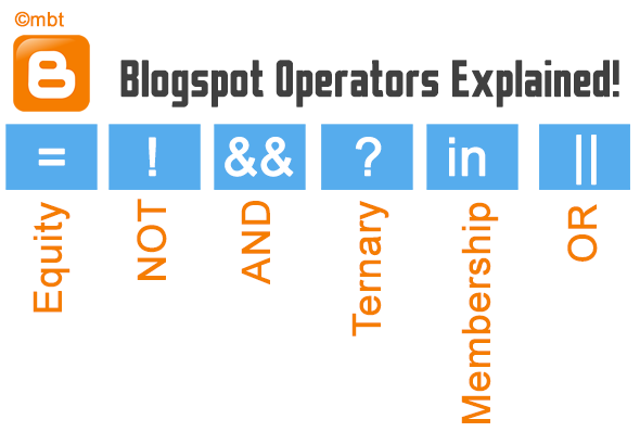 Are
we are going to discuss electronics or logic gates here? Of course not!
:) Blogger Team has recently made some performance based changes to
their XHTML Widget tags for layouts. They have introduced some logic
operators to simplify long conditional expression using short and simple
syntax thanks to Blogger Logical Operators. I have been testing Blogger
templates since 7 years and the best thing I loved about it is the
simplicity to retrieve data from the server. Although users are
restricted from accessing the server side and database records but they
have been given a great deal of access to call objects on Front end
using Layout tags. Lets get straight to the fun ride!
Are
we are going to discuss electronics or logic gates here? Of course not!
:) Blogger Team has recently made some performance based changes to
their XHTML Widget tags for layouts. They have introduced some logic
operators to simplify long conditional expression using short and simple
syntax thanks to Blogger Logical Operators. I have been testing Blogger
templates since 7 years and the best thing I loved about it is the
simplicity to retrieve data from the server. Although users are
restricted from accessing the server side and database records but they
have been given a great deal of access to call objects on Front end
using Layout tags. Lets get straight to the fun ride! Now
that you have learnt how to hide HTML content in Blogspot blogs using
the conditional tag "isMobileRequest", Its time to learn how to prevent
blogger Widgets from loading inside Mobile devices for Responsive
Blogger Templates. It is really important that your mobile site may load
as faster as possible due to slow internet speed of Mobile browsers. In
order to achieve this purpose, we need to hide some widgets that makes
no sense in small screen devices. These Sidebar widgets could include
your Fancy Subscription boxes, search boxes, Labels, Archives,
PopularPosts, Blog ROLL, Recent comments and so on. Most of these
widgets use jQuery or JavaScript that really slows down the site.
Therefor we will not just hide the Widget HTML content but would also
disable its javaScript. You can continue showing them in Desktop/Laptop
devices but it is really advisable that you hide such widgets for mobile
devices in order to speed up your Page load time as much as possible in
order to rank higher on Mobile Search results. We have experienced a
tremendous positive impact of this technique on our Blogger blog (mbt)
and it has really helped increasing our mobile traffic a lot. Lets get
started!
Now
that you have learnt how to hide HTML content in Blogspot blogs using
the conditional tag "isMobileRequest", Its time to learn how to prevent
blogger Widgets from loading inside Mobile devices for Responsive
Blogger Templates. It is really important that your mobile site may load
as faster as possible due to slow internet speed of Mobile browsers. In
order to achieve this purpose, we need to hide some widgets that makes
no sense in small screen devices. These Sidebar widgets could include
your Fancy Subscription boxes, search boxes, Labels, Archives,
PopularPosts, Blog ROLL, Recent comments and so on. Most of these
widgets use jQuery or JavaScript that really slows down the site.
Therefor we will not just hide the Widget HTML content but would also
disable its javaScript. You can continue showing them in Desktop/Laptop
devices but it is really advisable that you hide such widgets for mobile
devices in order to speed up your Page load time as much as possible in
order to rank higher on Mobile Search results. We have experienced a
tremendous positive impact of this technique on our Blogger blog (mbt)
and it has really helped increasing our mobile traffic a lot. Lets get
started!


 It
makes a lot of sense to always add your website name along with
Copyrights Date/time in Footer credits to let your users get accustomed
to your brand identity and also know that you reserve full copyrights of
the content you share on your blog. A credit link consists of mostly
your Trademark/benchmark name (i.e. Blog Title) and the Time interval
for which you deserve full ownership of your Blog resources and of its
use and distribution. When we design Blogger templates we often add
Credit links or attribution links at the bottom of the blog footer to
let everyone know who designed and developed the template.
It
makes a lot of sense to always add your website name along with
Copyrights Date/time in Footer credits to let your users get accustomed
to your brand identity and also know that you reserve full copyrights of
the content you share on your blog. A credit link consists of mostly
your Trademark/benchmark name (i.e. Blog Title) and the Time interval
for which you deserve full ownership of your Blog resources and of its
use and distribution. When we design Blogger templates we often add
Credit links or attribution links at the bottom of the blog footer to
let everyone know who designed and developed the template. 
 Like Our Facebook Fan Page
 Subscribe For Free Email Updates


No Comments Yet
Add your comment